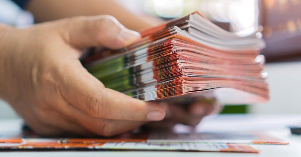
Printed brochures can work wonders for your marketing strategy. They are versatile tools that can inform, persuade, and inspire your audience—all in one compact package. A polished design is only half the battle though; high-quality printing is vital to make your ideas shine.
This guide dives into the best practices for printing professional brochures, offering actionable tips to leave a lasting impact.
1. Start With High-Quality Files
The foundation of a brochure begins with the file itself. Work with high-resolution images (300 DPI or higher) and vector graphics to avoid blurry or pixelated elements. Formats like PDF or AI are preferred for print-ready files since they retain clarity and are compatible across printing systems.
A consistent color mode is another vital step—design in CMYK (cyan, magenta, yellow, and black) instead of RGB (red, green, blue). CMYK is optimized for printing, making it easier to reproduce colors accurately on paper. If you’re unsure about color consistency, perform test prints to check if what you see on-screen aligns with your expectations.
Include a bleed area in your file, extending 0.125″ to 0.25″ past the edge of your design. This step eliminates the risk of white edges after trimming, giving your design a polished, full-page finish.
2. Choose the Right Paper Stock
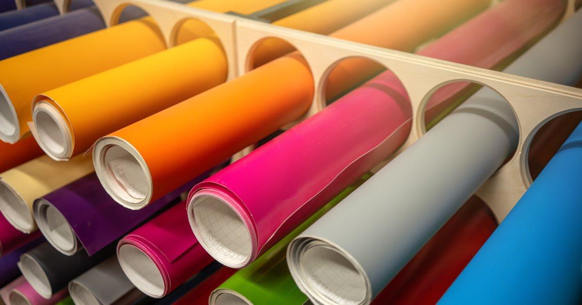
Paper can completely change the look and feel of your brochure. While there isn’t a single “correct” choice, selecting the right paper stock depends on the purpose of your brochure and your budget.
To achieve a polished effect, select thicker paper coated with a matte or glossy finish. This option amplifies color vibrancy and gives your pieces a sophisticated look.
20-lb bond paper is a great option for creating lightweight, cost-effective brochures for large-scale distribution. It’s budget-friendly yet sturdy enough for standard printing. Before deciding, consider the paper’s weight, surface texture, and finish. Unsure of what to pick? Get paper samples from your printer to make an informed choice.
3. Design for Readability
A beautifully printed brochure won’t hit the mark if it’s hard to read. Balance design with content to provide a clear, enjoyable reading experience that engages your audience.
- A clean layout: Use a grid structure to organize sections, preventing text and images from appearing cluttered and improving readability.
- Stick to legible fonts: Limit yourself to three fonts, and keep body text size between 10 point and 12 point for readability. Combine a simple font for the body text with a bolder heading to create contrast.
- Be selective with colors: Stick with a complementary palette that aligns with your branding but doesn’t overwhelm the eyes. Avoid bright or clashing colors that distract from your message.
4. Pay Attention to Fold Types
Folds are more functional than you might think. The way your brochure is folded will affect how readers interact with your content. A well-chosen fold enhances the design and guides the flow of information. Some common fold types include:
- Tri-fold: The most popular option for brochures. This fold is divided into three vertical sections and works well for storytelling and step-by-step layouts.
- Z-fold: Creates a “zigzag” layout, offering a modern and creative style.
- Gate-fold: Two panels open like doors to reveal the main section, creating a dramatic effect for featured content.
Your brochure’s fold can impact how your audience engages with it. Choose a fold that aligns with your content and draws the reader through your message. Be mindful of fold lines during your design process, leaving extra space to avoid trimming vital details. A thoughtful fold design can make your brochure functional and memorable.
5. Proofread Your Content Multiple Times
Spelling and grammar mistakes can be glaring when printed, leaving a poor impression on your audience. To avoid this, proofread your content carefully—at least twice. Take your time to read it slowly, paying attention to every detail. Better yet, ask someone else to review it for you. A fresh set of eyes can spot errors you might overlook, such as typos or inconsistencies in tone.
But don’t just stop at the text—proofreading should extend to your entire design. Check for alignment, spacing, font consistency, and design integrity across all pages. Even something as minor as a misplaced logo can disrupt the professional look of your final product. Take a few extra moments to catch these issues before it’s too late.
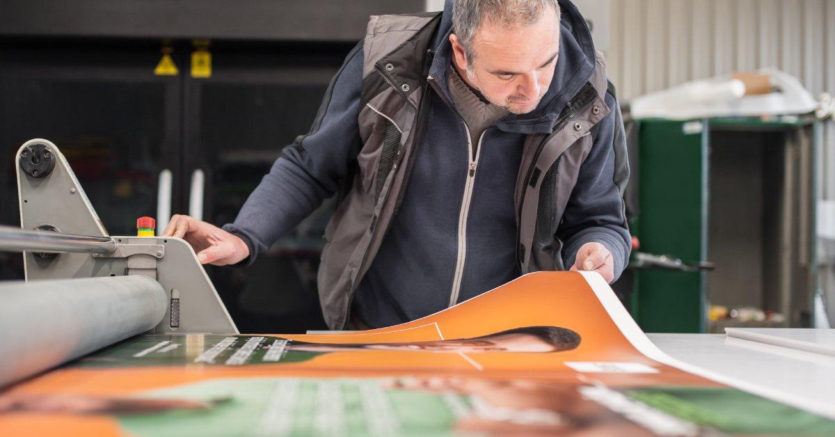
6. Match the Print Quality to Your Purpose
Your printing choice should align with how your brochure will be used. For premium events like trade shows or product launches, offset printing produces superior results with sharp text and vibrant images. While more expensive, it’s worth the cost for high-end projects.
For smaller runs, digital printing is a versatile option. Though slightly less crisp than offset printing, it’s cost-effective and allows for faster production.
If you’re managing bulk poster- or brochure-printing projects, we’re here to help! At Plotter Paper Guys, we provide high-quality printing materials that will achieve polished, professional results. Partner with us for reliable supplies that bring your vision to life.
7. Add Tactile Finishes
Make your brochure stand out by including special touches like embossed logos, foil stamping, or UV coating. These tactile finishes can elevate your brochure and create a memorable first impression.
However, keep in mind that these additions often add to the production cost. Use them sparingly and only when they enhance the tone and purpose of your design.
8. Plan for Distribution
It’s easy to focus solely on the design and printing process, but consider how your brochures will be distributed. Will they be given out at events, mailed to clients, or displayed in stores?
Each distribution method might require different paper stocks, sizes, or protective coatings. For instance, brochures sent in the mail benefit from sturdier paper that withstands handling, while in-person distribution allows for more creative options.
Final Thoughts
Creating a flawless brochure requires more than just a great design—it also requires careful attention to printing details. By following these best practices for printing professional brochures, you can make sure your materials look polished and reflect your brand’s vision. Choose your paper stock wisely, focus on fold types, and proof thoroughly to deliver a final product that leaves a lasting impact.
For additional tips or to source top-tier supplies, connect with Plotter Paper Guys! We’re here to guide you to success. Don’t just print—let us help you do it the right way.