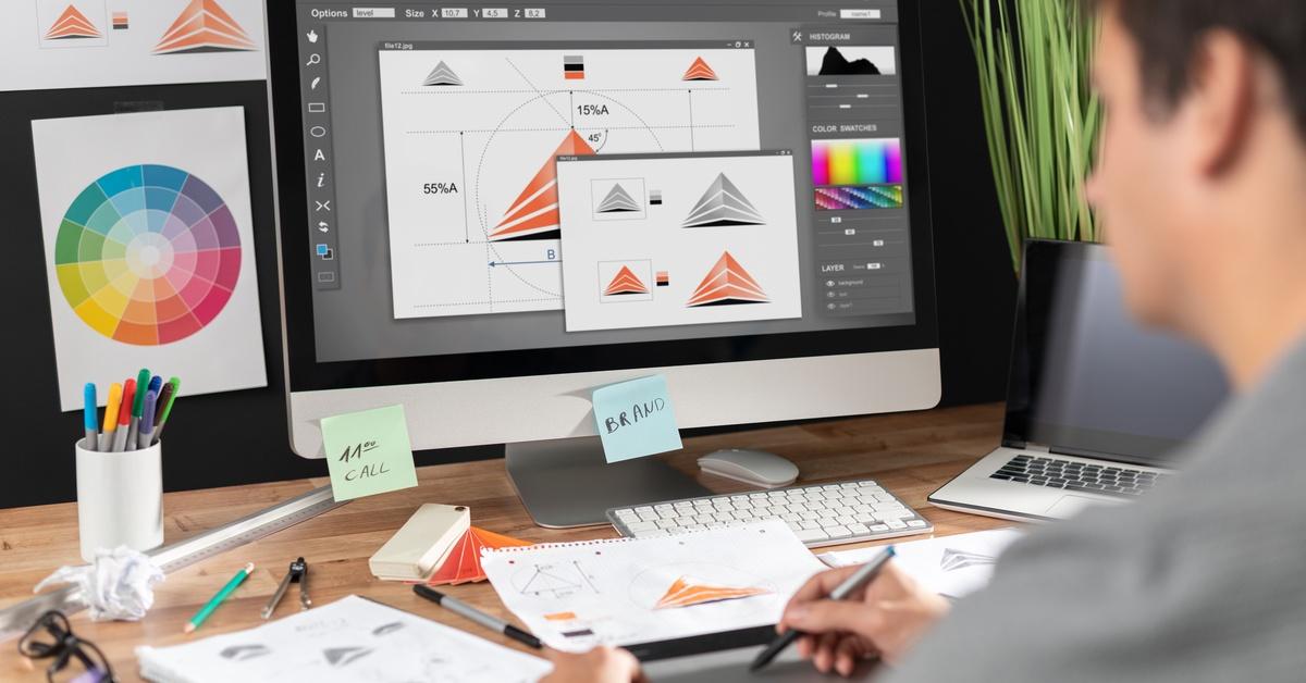
Visual marketing materials play a powerful role in how people perceive a brand, and they are often the first thing customers notice about your business. Choosing the right visuals helps you tell your story, promote your company’s values, and build trust with your audience. It also helps to set you apart in a sea of competitors.
Keep reading to learn ten design tips for choosing your company’s graphics to help you craft visuals that leave a positive impression. Whether you’re designing a new logo or refreshing your promotional materials, this blog will guide you through the process of creating imagery that displays your brand in the best way possible.
1. Understand Your Brand Identity
Your brand’s identity should serve as the foundation for all your graphic choices. Start by defining what your business stands for—your mission and core values. This will indicate to potential clients whether you are a fun and approachable brand or a more traditional one that focuses on professionalism and reliability.
Graphics should align with your company’s mission. They’re visual extensions of who you are as a business. For example, a tech-focused company might lean toward sleek, modern design elements, while a family-owned bakery might favor softer visuals. When selecting designs, always ask yourself if they feel on-brand.
2. Prioritize Simplicity
Clean, simple designs work. Think of globally recognized logos that are memorable and also easily recognizable. Busy or cluttered graphics can overwhelm and confuse your audience, so focus on designs that are visually captivating without being overly complicated. Avoid adding unnecessary elements just for the sake of filling in blank space. Simplicity means every detail serves a purpose.
3. Choose a Cohesive Color Palette

Colors can evoke emotions, influence perceptions, and create associations within customers’ minds. For example, blue often conveys trust, while green represents growth or nature.
Look for colors that reflect your brand identity and balance well together. Aim for a handful of complementary shades to keep things cohesive. Online graphic design tools can help you build an effective palette. Once you find the right combination, use these colors consistently across all your visual assets.
4. Use High-Quality Images
Poor-quality visuals can leave a bad impression. They suggest carelessness and can undermine your brand’s credibility. Always use professional, high-resolution images and graphics to represent your business. Make sure your files are optimized for print and won’t lose clarity when you scale them up. Investing in quality assets upfront will save you from having to redo work later.
Choose images that align with your brand’s tone and message. Avoid overused stock photos, as they can make your marketing materials look generic. Always preview your designs to see that colors and details appear as intended.
5. Focus on Typography
Fonts have an understated yet important impact on graphic design. Clean sans-serif fonts look modern, while serif fonts give a classic, more traditional vibe. Typography directly influences readability, so designers must balance aesthetics with practicality to ensure the audience can read the intended messages.
Pick two font families that complement each other and use them consistently. If your customers can’t quickly understand your messaging because the font is difficult to read, your design has failed its purpose. Keep things simple, clean, and on-brand.
6. Ensure Scalability and Versatility

Your graphics should look good on everything from small business cards to large-scale posters. Use vector files for your designs so they are scalable and retain their quality. Vector files are a higher resolution format, unlike pixel-based images.
Versatility is also important. For example, a small Facebook banner design might not work on your large storefront signage due to its shape or dimensions. Create graphics that are flexible enough to work across different platforms and sizes without losing their impact.
7. Keep Your Audience in Mind
Great design doesn’t just incorporate what you love—it also needs to resonate with your customers. Consider their preferences, pain points, and needs as you pick visuals. What appeals to a younger audience might not feel right for older customers.
For example, if your target audience is eco-conscious, soft greens and earthy tones will likely speak to them. Pay attention to their expectations, and work with a designer who understands those nuances.
8. Stay Consistent Across All Media
Consistency helps build familiarity in customers’ minds. When customers see the same design elements across your website, packaging, social media, or printed flyers, they’ll start recognizing your brand faster.
To maintain consistency, create brand guidelines outlining rules for how graphics should be used. This document should cover logos, spacing, colors, and typography.
9. Incorporate Trends Wisely
Trends can add a fresh feel to your designs, but don’t fall into the trap of overusing them. What’s “in” today might feel outdated tomorrow. Take inspiration from trends, but ground your designs with timeless elements to strike a balance.
For instance, while minimalist illustrations or bold, oversized letters might be trending this year, you should feel confident they will still align with your brand five years from now before applying them.
10. Test Designs and Gather Feedback
Your first draft rarely becomes the final design. Testing your graphics on a small audience can offer valuable insights you might not catch on your own. Get feedback from your colleagues, team, or focus groups.
Ask the following questions:
- Does the design reflect our brand identity?
- Is it visually appealing and easy to understand?
- Does this resonate with our target audience?
Use any constructive criticism to improve your designs.
Create Graphics That Strengthen Your Brand
Crafting the right visuals is a creative and strategic endeavor. Each element contributes to how your business is perceived and remembered by customers. These ten design tips for choosing your company’s graphics can help you refine your approach and make more thoughtful design decisions. Start applying these tips today to see how smart graphic design can elevate your brand’s presence.
When you’re ready to print your new graphics, work with Plotter Paper Guys. We provide high-quality materials such as 24-lb. bond paper to ensure your designs look professional.


